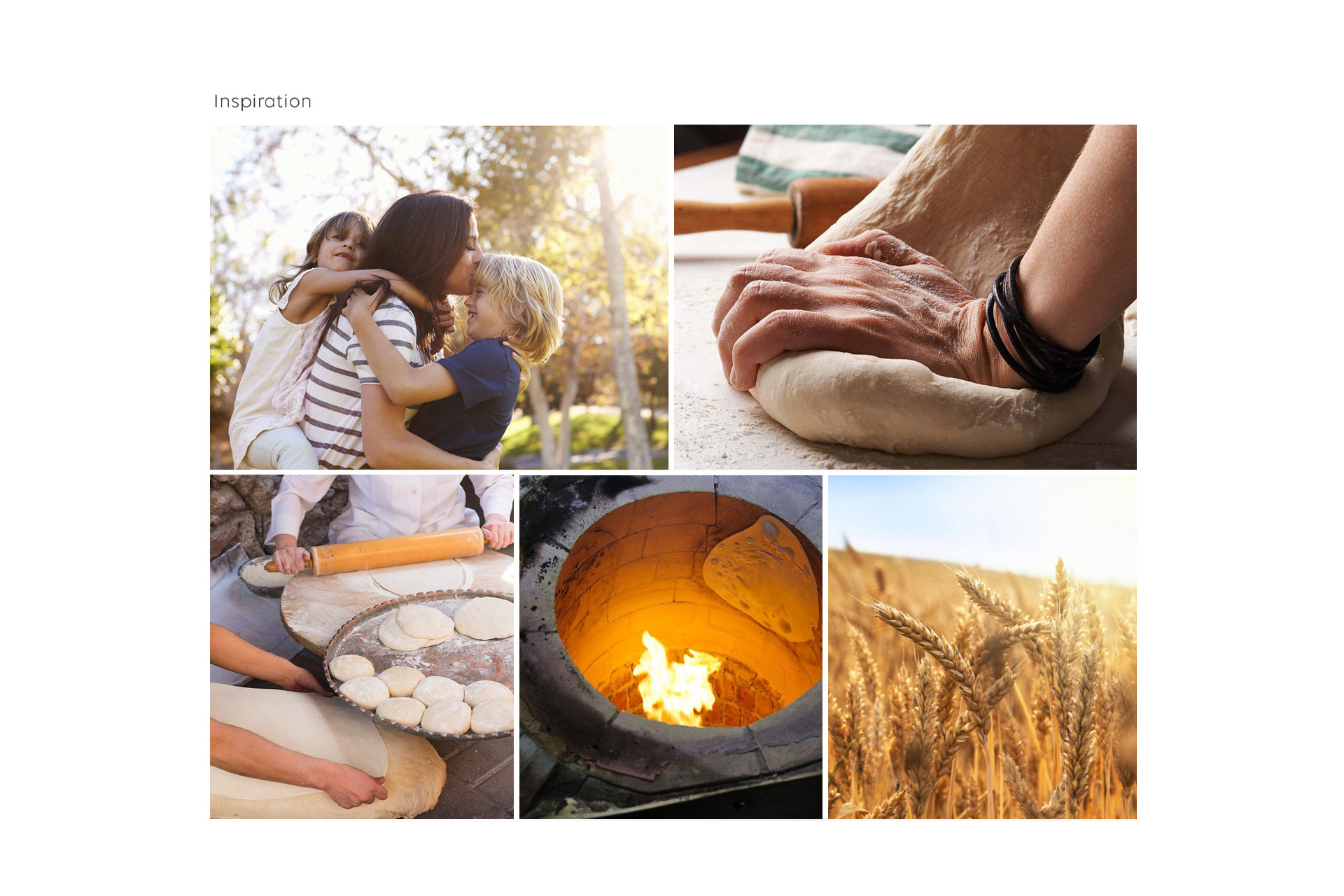
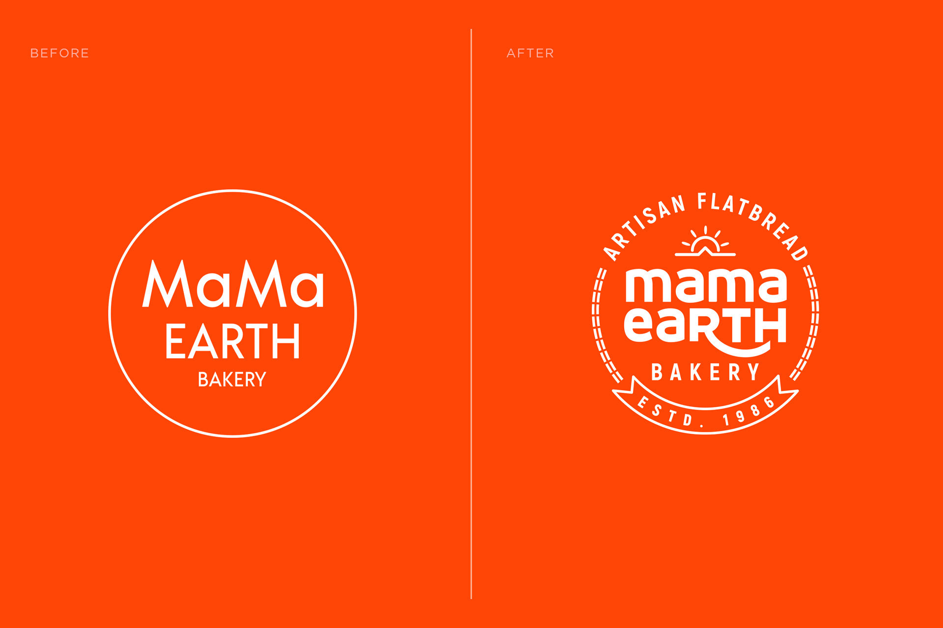
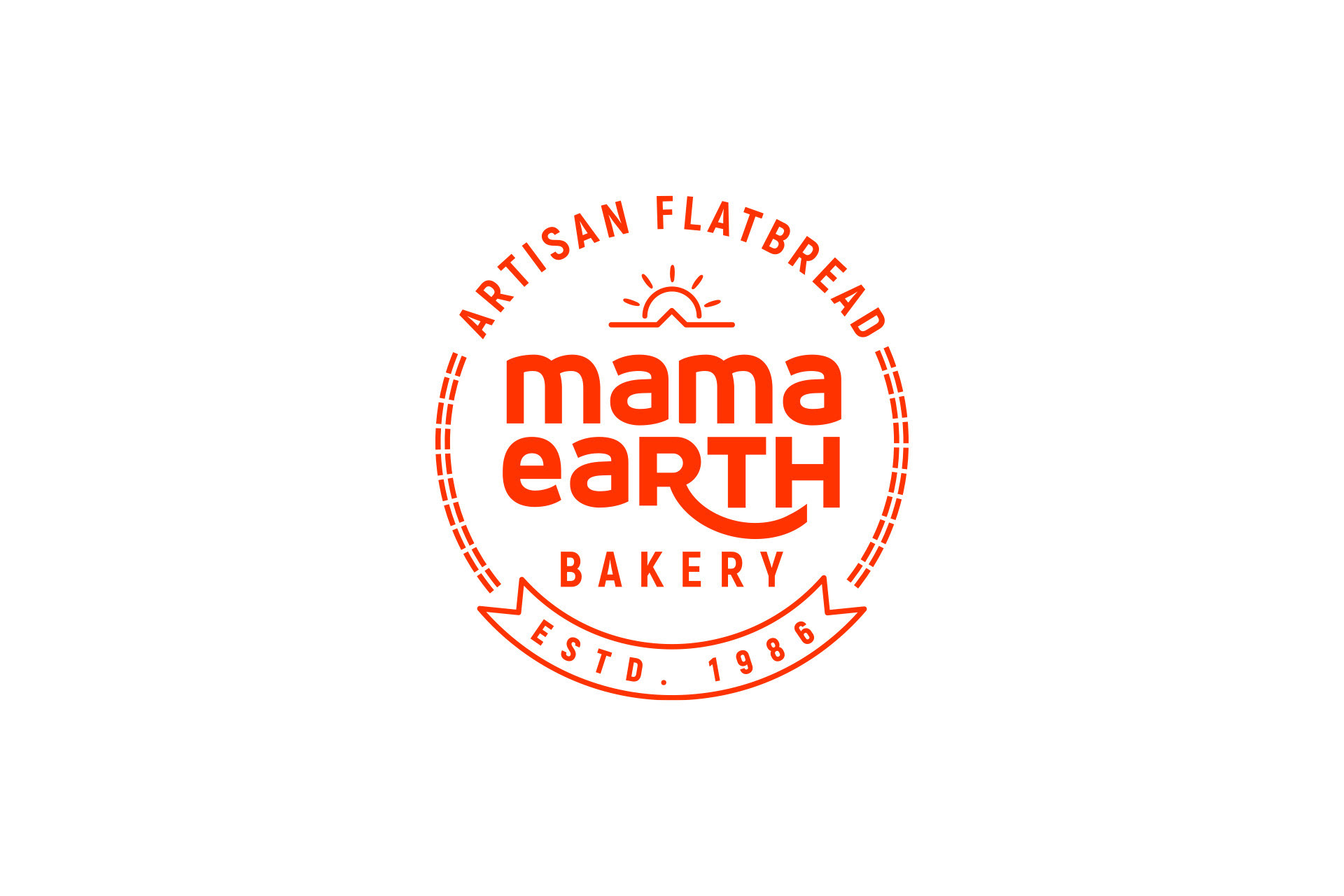
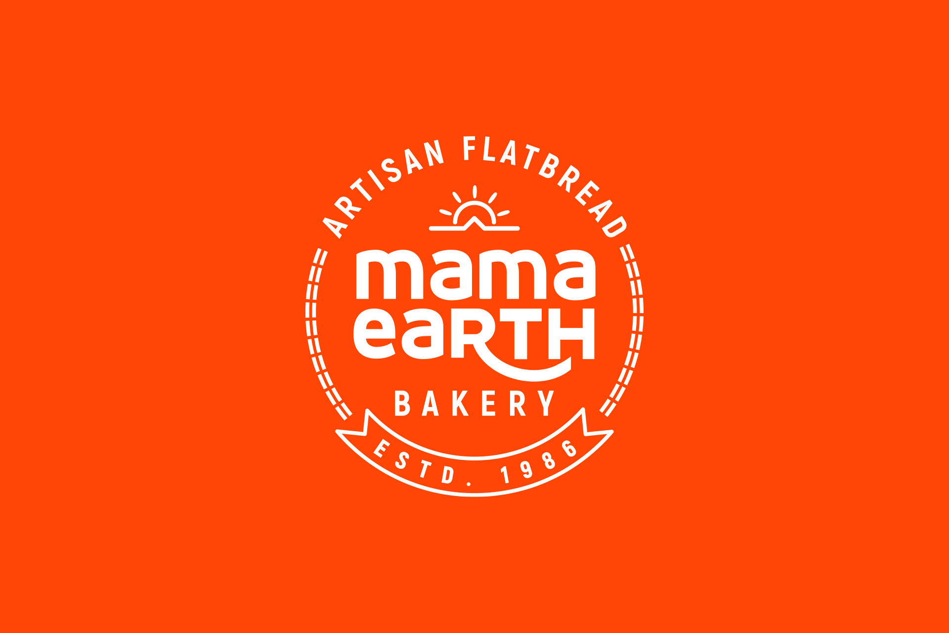
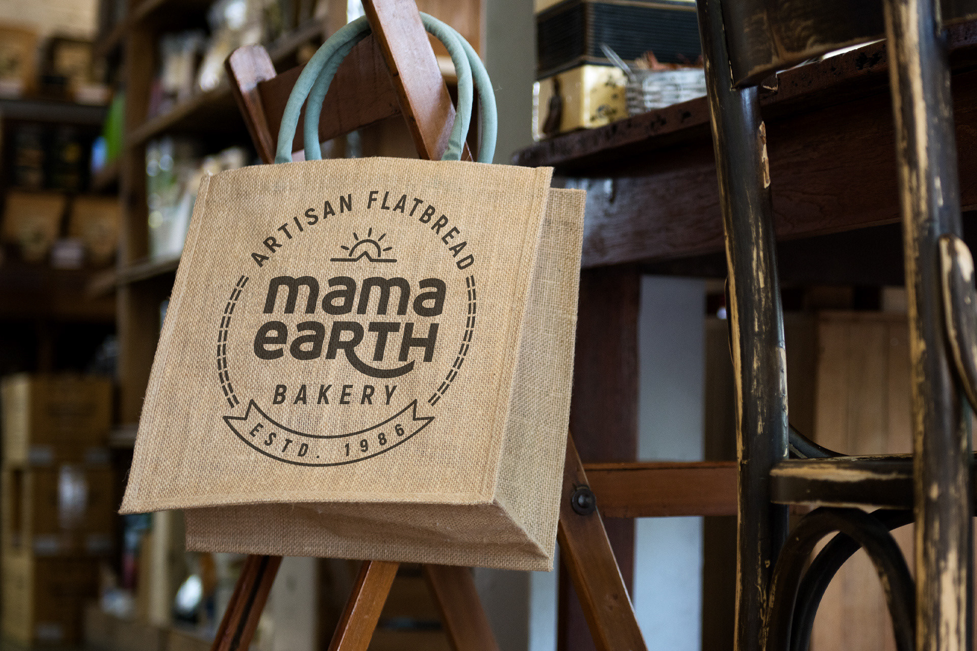
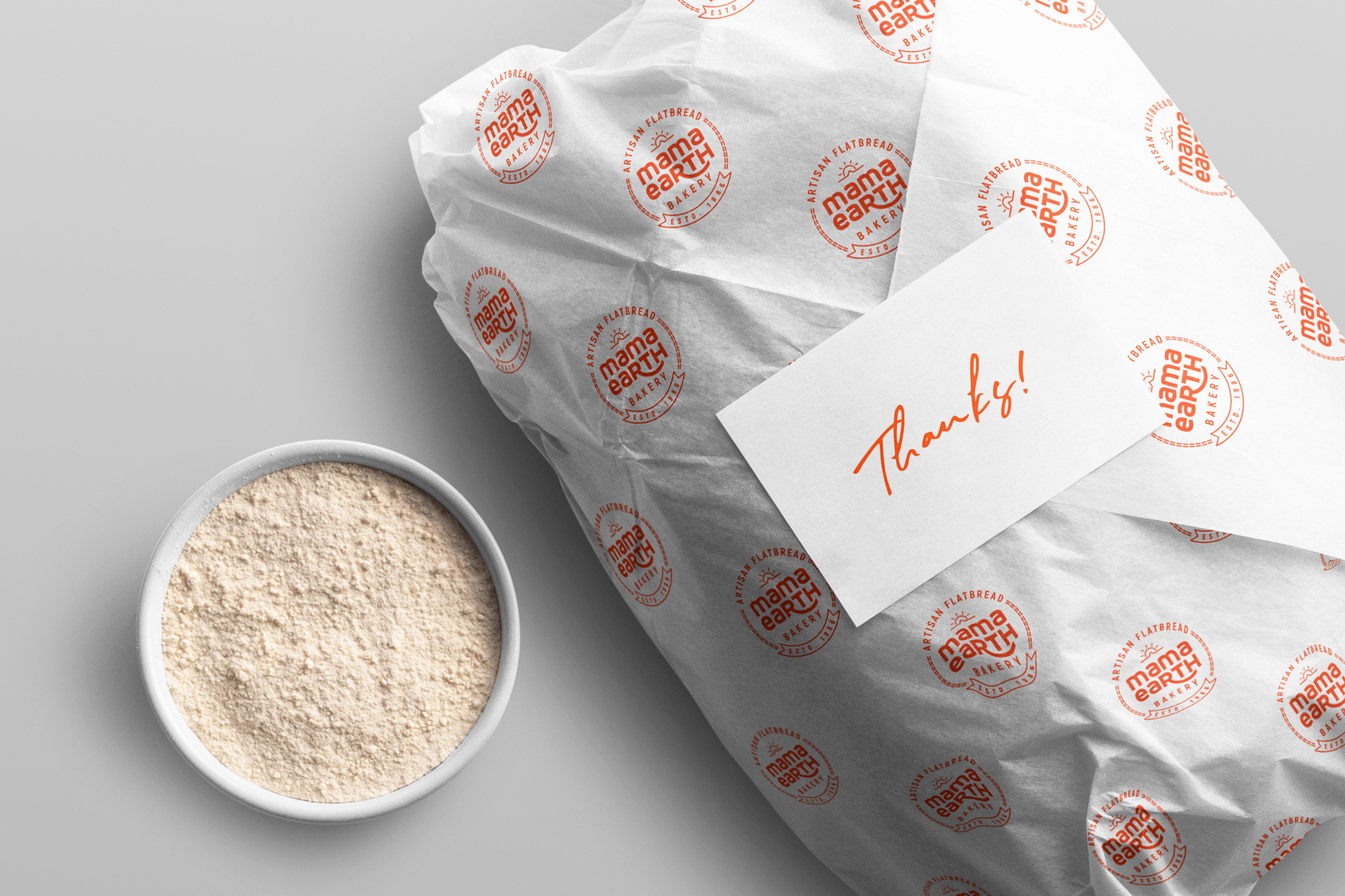
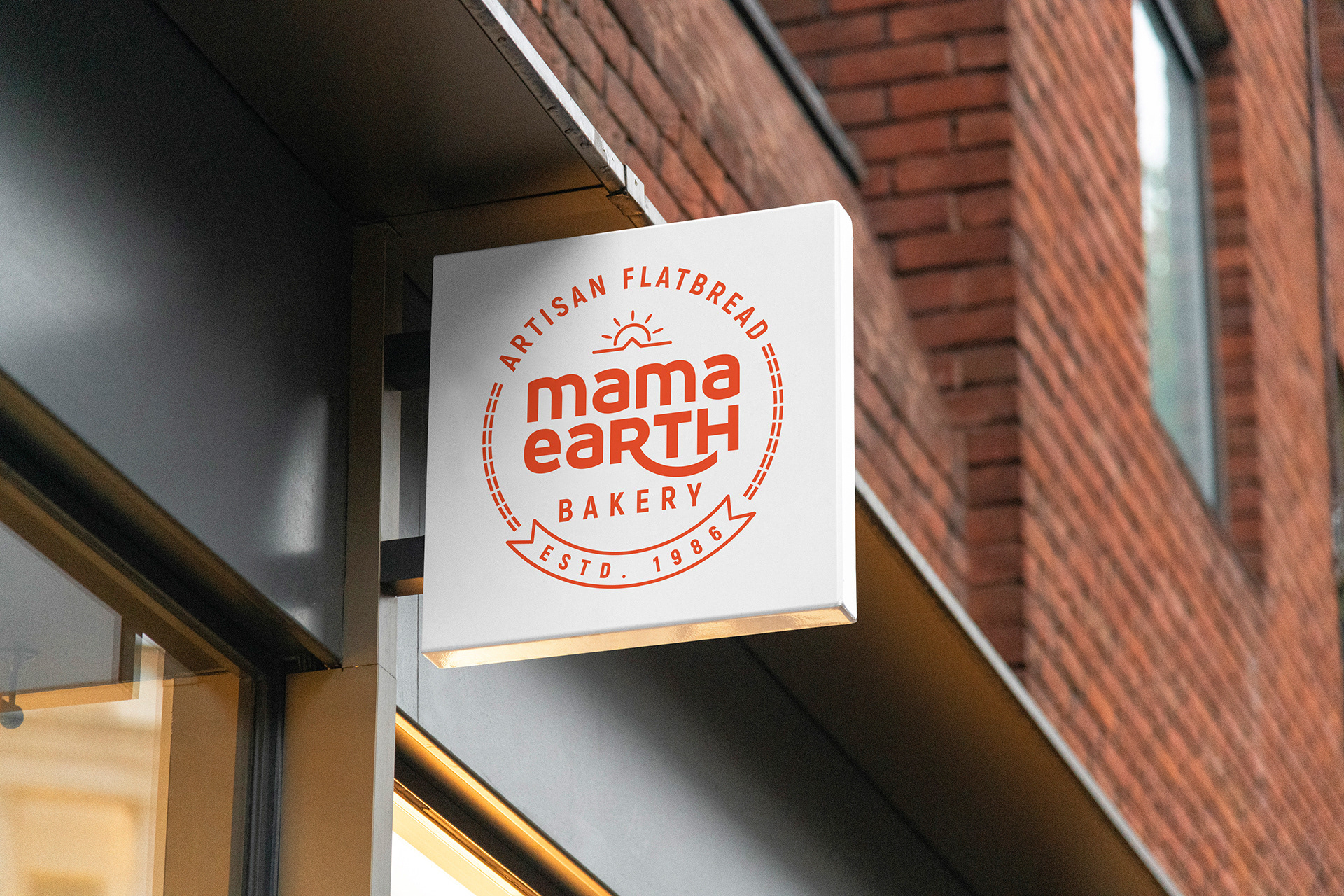
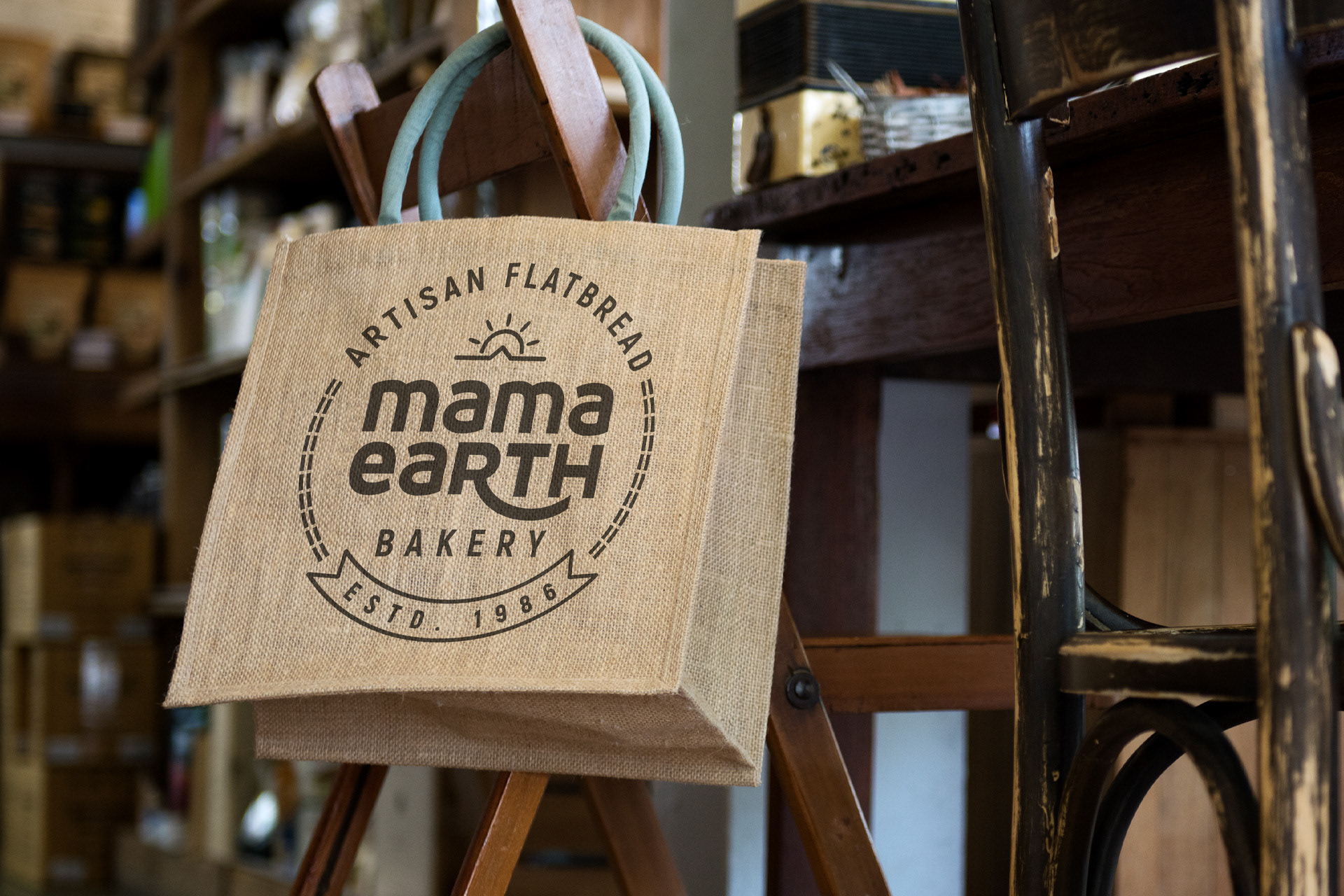
PROJECT : Logo Redesign for Mama Earth Bakery. Their specialty is baking Flatbread which is called Lavash in the Middle Eastern Region. The main aim behind the redesign was to reintroduce the brand as an organic, natural, healthy and earthy option for the younger generation.
SOLUTION : A distinctive, vibrant and organic visual identity for Mama Earth Bakery which encapsulates an optimistic spirit through the use of a vibrant color palette, iconography and a combination of typefaces. The customized typeface with softer edges is meant to impart a sense of the care and detail that goes into making the products with a warm, personal vibe.
The subtle sun icon and the invocation of the tonir infuses the mark with a sense of artisanship, health and goodness of nature.